Negative Space Gives a Painting Room to Breathe
Negative space in a painting helps you see how forms lean, gather, and separate, making composition easier to read without treating blank areas as empty.
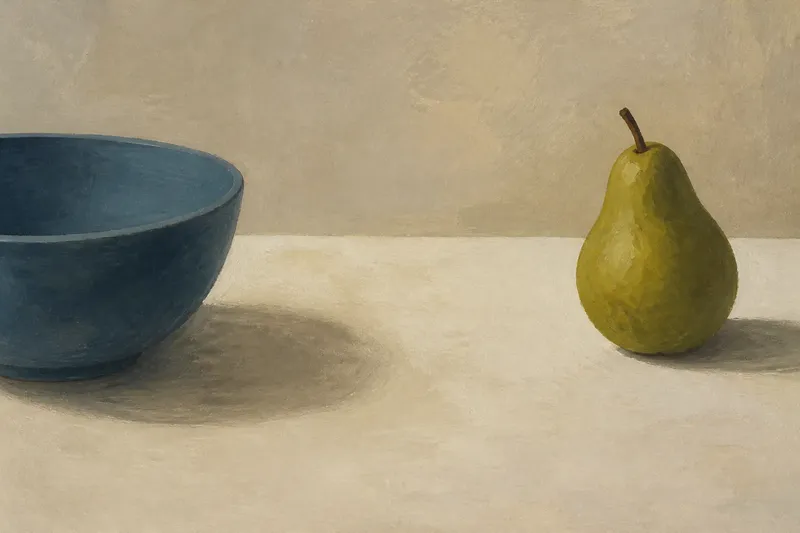
A blue bowl sits near the edge of a still life, with a pale strip of canvas between it and a pear. That strip may look like nothing at first. Follow its shape, though, and it begins to describe the bowl’s curve, the pear’s distance, and the pressure of the whole arrangement. Negative space in a painting is not simply what the artist left untouched; it is part of how the visible forms meet.
What counts as negative space?
Positive space is occupied by the subject’s recognizable forms: a vase, a hand, a tree trunk. Negative space is the area around and between them. It may be bare canvas, a flat field of color, a loosely brushed wall, or a patch of sky. The term describes a relationship, not a material. A painted background can function as negative space just as readily as unpainted ground.
The distinction also shifts with attention. Look at a chair against a wall and the chair reads as the object. Look instead at the shape enclosed by its legs and crossbars, and that gap becomes a form with its own outline. The chair has not changed; your attention has changed jobs.
For viewing, this shift is useful because it slows the habit of naming things. Instead of moving from “chair” to “wall” to “floor,” notice the intervals: how wide the gap is, where it narrows, and whether its edges feel calm or tense.
How does negative space direct attention?
Our eyes often settle first on a prominent face, bright mark, or sharply defined object. The surrounding areas then help determine where attention moves next. A narrow gap can point toward a small detail; a broad, quiet field can give a cluster of objects room to register before the eye leaves it.
Edges do much of this work. Where a dark sleeve meets a light background, the boundary is easy to follow. Where the two values are close, the edge may soften, and the figure may seem to recede or merge. The space around a form therefore guides attention partly through contrast, and partly through the absence of a hard boundary.
Try tracing an imaginary route along the boundaries of the quieter shapes. Does a strip of background carry your eye upward? Does a wedge of shadow turn it back toward the center? These routes need not be deliberate arrows. A well-placed interval can nudge attention without announcing itself as a device.
What can the gaps tell you about a composition?
Negative shapes make spacing visible. Two objects may each be beautifully painted, but their interval determines whether they seem to touch, converse, compete, or keep their distance. A narrow space between a figure’s arm and torso can make the pose legible. If that opening closes, the arm may merge into the body and the gesture changes.
Look for the shapes formed between multiple objects, not only the open area around the outer edge of the arrangement. In a still life, the gap between a glass and a folded cloth may be a slim triangle. That triangle can balance the larger, rounded forms, or it can make the objects feel crowded. Its outline is a clue to the composition’s internal rhythm.
Imagine a painter arranging a red mug and a green apple on a table. If the mug’s handle nearly touches the apple, the small crescent between them may become the most delicate shape in the group; moving the apple farther away would widen it and make the objects feel more separate. The objects remain the same, but the relationship changes visibly.
Why do some empty areas feel active?
A quiet area is not necessarily passive. A broad field of pale paint beside a dark figure can feel expansive, as if the figure has space to turn or move. The same field may feel oppressive if the figure is pressed against one edge and the remaining area seems to loom over it. Placement matters as much as size.
Shape matters too. A smooth, even margin can settle a composition. An irregular gap, pinched at one end and open at the other, may seem to lean or funnel attention. Compare the gap’s contour with the contour of the subject beside it: parallel edges can feel orderly, while a sudden change of direction can create a small visual jolt.
Negative space can also carry atmosphere without becoming a depicted object. A large unpainted area around a solitary form may suggest quiet, exposure, or distance, depending on the work’s marks and colors. These are readings to test against what is visible, not fixed meanings assigned to blankness.
How can you study negative space in a painting?
Begin with a few specific observations. There is no need to catalogue every gap. Choose one that seems important and ask what its edges, scale, and position are doing.
- Find the largest quiet area. Notice whether it surrounds the main subject, sits to one side, or cuts across the composition.
- Compare two gaps. A wide interval and a narrow one can make neighboring forms feel differently related.
- Trace an enclosed shape. Look between a figure’s limbs, through a chair, or among clustered objects.
- Follow the edges. Note where boundaries are sharp, soft, broken, or lost against similar colors.
- Check the margins. Compare the space above, below, and beside the main forms; uneven margins can create balance or tension.
- Return to the subject. Ask whether the gaps clarify a gesture, make a form feel isolated, or pull your eye elsewhere.
A useful viewing habit is to switch back and forth between the named object and the shape around it. If a tree is easy to identify but the sky between its branches feels tangled, that patch of negative space may explain why the silhouette reads as dense. The aim is not to replace the subject with a puzzle. It is to notice how both readings support each other.
What should you look for in different kinds of painting?
In a portrait, inspect the spaces around the head, neck, and shoulders. A wedge between a shoulder and the frame can make the pose feel open or cramped. The space above the head also affects how much visual room the person seems to have.
In a landscape, look between tree masses, buildings, or layers of hills. A channel of sky can separate forms that would otherwise collapse into one band. If the painter uses similar colors across distant shapes, a change in the surrounding gap may do more to distinguish them than added detail.
In abstract painting, it can be harder to call one area “the subject” and another “the background.” That is part of the point. Follow changes in density: where marks gather, where they thin, and whether a quieter patch steadies or interrupts the pattern. Do not strain to assign every region a role. Some paintings make the distinction deliberately uncertain.
Which questions help when you are looking closely?
Is negative space always unpainted canvas?
No. It can be a painted background or any quieter area that separates or surrounds forms. The useful question is how that area relates to the shapes beside it, not whether the canvas shows through.
Can negative space be the main subject?
It can carry much of a composition’s interest, especially when the open shapes are sharply arranged or unusually prominent. Even then, those shapes remain connected to the forms that define their edges.
How do I know whether a gap is intentional?
You cannot always know the artist’s intention from looking alone. You can still observe whether the gap is clearly shaped, repeated, or balanced against other areas, and describe the effect those choices have on your reading.
What if the background is full of detail?
Detailed surroundings can still contain negative spaces where forms separate or open onto quieter passages. Follow the local relationships rather than assuming that only a blank field counts.
What is not worth the effort?
It is rarely helpful to name every patch of open space or decide that each one must symbolize something. That turns looking into an inventory and gives the blank areas more certainty than the painting does. A few observable details—one gap’s outline, a shift in contrast, a change in distance—are usually enough to make the composition more legible.
Negative space in a painting is easiest to notice when you let your attention move between an object and the shape it leaves around itself. Next time a composition feels crowded, spare, or slightly off balance, look at the intervals before blaming the objects. The missing-looking part may be doing the clearest work.